Showing posts with label Photobooth Friday. Show all posts

Friday, August 15, 2014

Photobooth Friday, No. 53

In memoriam, Peter Torres.


Roughly a year ago I lost my Uncle to cancer. He was beloved by me and my family. Full of life - loud and boisterous to the end. Unafraid of the challenges life gave him, which he endured with style, grace and a sense of humor. I miss him very much.

While I was still working on Bloodspell, I remember telling him about the book, to which he excitedly asked in his booming voice, "CAN I BE IN IT?" I knew there was a scene in the book featuring the super villain 'The Key' and what with my Uncle's trade being that of a locksmith, it was just too perfect. I sent him scans of my layouts, his daughter Lil took the photos, and that was that.

He was a natural of course-


Hamming it up for the camera is in our blood, apparently.


Unfortunately he never got to see the finished book, but I'm thankful that he was a part of it.

I'll keep on mugging for the camera.


Friday, August 1, 2014

Photobooth Friday, No. 52

Guardians of the Galaxy edition!
Today Marvel's new movie the 'Guardians of the Galaxy' hits theaters, so I thought why not feature an illustration I did recently in celebration of the movie. Here's the full image:
I was commissioned to make this piece for Variety magazine for use along with an article they were running about the film, it's producer Kevin Feige (pictured above in blue) and director James Gunn. You can read the full article here.

Basically I was asked to draw up a "fun, heroic group shot" of the crew from the movie, along with producer Kevin Feige, "in an alien/space setting." Thankfully they basically went for my first idea--looking at the group in an anti-gravity setting aboard a starship. I also added in a small narrative of Kevin wearing Star Lord (Chris Pratt)'s headphones as seen in the trailer. Star Lord reaches for them, trying to peel them back off Kevin's head. Here's a look at the initial sketch, and a follow up tweaking of it after some notes from art director, Chuck Kerr:


Some photoboothin:

A look at the rest of the process from digital pencils to real inks to digital color:
And finally, some detail shots of my inks:

And that about does it! I'm off to the movies, y'all. :)

Have a great weekend!

Friday, June 6, 2014

Photobooth Friday, No. 51

Black Cat and Spidey edition!
Today I thought we'd look back at the Amazing Spider-man cover I drew for issue 700.3 last year. 
This one.
This cover was actually based on a sketch I drew as a stock cover for Marvel back in 2009. They decided not to go with it at the time, but apparently kept it on file, asking me to finally make it into a cover four years later. Anyway, here's a look at some of the Photo Booth references I worked with for the piece:


Mostly I was studying hand gestures with these
From here I got started on my digital pencils for the piece. Converting my original sketch to cyan, I used that drawing as a loose guide to pencil atop of. Here's a progress shot:
Working digitally was a great advantage here as Photoshop made it easy to create symmetrical shapes and mask out areas of the 'webbing panels' to draw within.
Finally, here's a look at my process from that initial sketch, to my digital pencils and finished inks. 

Thanks for reading, y'all. Have a great weekend!


Friday, May 30, 2014

Photobooth Phriday, No. 50

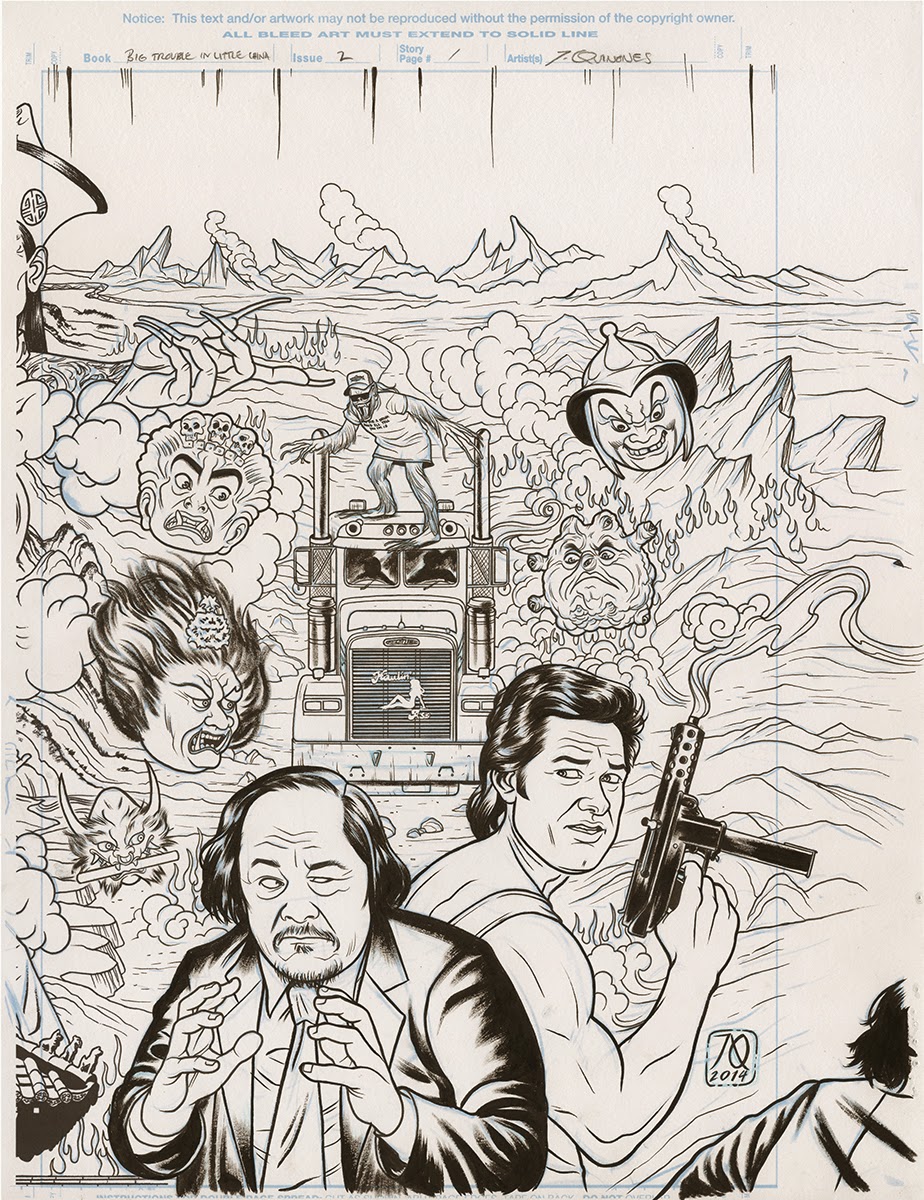
BIG TROUBLE edition.

Today we're looking at my first two covers for BOOM! comics upcoming mini-series, Big Trouble in Little China, based on the cult film from the eighties. I'm doing a series of connecting covers for the series, which was a lot of fun to put together, if a bit work intensive. Here's a look at my Photo boothin':
This? This is nothing - but that's how it
always begins...

I pencilled this cover digitally, using my Wacom Cintiq. It made drawing and aligning this long connecting piece a bit easier than if I were to try and do it by hand. I worked atop a loose thumbnail, fleshing out all of cover 1, and most of cover 2 at first. Covers 3 and 4 were drawn in separate instances, but I always drew more than I needed for any single cover so that I'd have something to build off of on the next.

Digital 'pencils'
After the pencils were completed, I converted them to cyan and printed them out on bristol to ink over. Here's a look at the rough scans for each cover:


Because of time constraints, and sheer size, I decided to ink each cover individually, rather than as one long scroll. As it stands, each original was inked on a sheet of 14x17" bristol board, making it infeasible to try and ink them all on a single sheet of paper. I'd either need one enormous long scroll or I'd have to scale down the image, sacrificing detail, hence my decision.
As you can see, for each cover I drew/inked past the crop marks, bleeding toward the next cover. This was to make sure each proceeding cover would link to the previous one in a seamless way. Of course I had to do some photoshop tweaking to really make it work, but this helped. 

Here's another detail shot:

The digitally connected covers 1 and 2:

And to round things out, here's a look at their finished colors:


Annnd that about does it. Have a great weekend folks!


Friday, May 23, 2014

Photobooth Phriday, No. 49

Well it's been a while, but with the release of Bloodspell this week, I thought this as good a time as any for the return of Photobooth Phridays: Black Canary and Zatanna edition.

More specifically, we'll be looking at the cover to the book. Of course, we start off with a sketch (see my previous post for more details on that), then it's off to pencils and inks.

Here's the Photo Booth element:

Specifically I was looking to nail down hand gestures and fabric folds here. I broke out this nifty white jacket (a Savers find) for maximum contrast.

The tiger eyes were drawn on a separate page of bristol, then digitally composited.
I was feeling ambitious with this one, so I broke out my airbrush to do glowy highlights on the stars, flames and what-not. Then it was on to colors--

Here you can see a bit of my process in beginning with flat color, then slowly modeling out the forms. Closeups below:


For more details on my modeling/painting process, click here.

This file had a LOT of layers, you guys.
My god... somebody turn the line layer back on.
And lastly, here's the finished cover:
Thanks for reading along, all. See you soon!


Friday, February 22, 2013

Photobooth Phriday, No. 48


Bob & Bobbie edition.

I don't often get to do caricature in my line of work, but I used to do it quite often. In college, I wrote the movie reviews for my school paper (they were terrible) and accompanied them with small caricatures of whichever celebrity was starring in whichever movie. I've always enjoyed drawing faces, so it was fun.
Well recently Mark Chiarello contacted me about drawing caricatures of two of DC's big whig's; Editor-In-Chief Bob Harras and Editorial Director Bobbie Chase. The illustration was to accompany a weekly column about all things DC, hosted on CBR. I hadn't yet talked about it on here, so I thought I'd post it as a Pho. Phri. Speaking of which, here's the Photobooth part:


Annnd here's some embarrassing caricatures from my college days.


Have a good weekend, all!

Friday, January 25, 2013

Photobooth Phriday, No. 47

Classic Carol edition!

Today we'll be looking at my cover to issue 11 of Marvel Comics' Captain Marvel series. Passers by may ask, where did that lovely lady come from? Well, partially from here:

...I'm so sorry.

Indeed, as those who follow this feature know, I'm often my best and only model, hence the above sillyness. Of course what I'm looking for here is not a bearded (yet disturbingly handsome) comic artist, but instead I'm looking at things like the fold in the fabric along my shoulder, the modeling of my hand, possible ways to light the figure, and so on.

The basic concept of the piece was to have Carol (The Captain) running across rooftops, juxtaposed against a sunny idealistic vision of herself in the form of an old, vintage ad. I wanted to evoke the classic pin-up illustration of the 1950's/60's, and for that, I turned to one of the great masters of the era, Gil Elvgren-


Elvgren captured a wonderful playfulness and optimism in his work, which I hoped to try and capture here. 

Originally I'd wanted to paint the 'poster' separately and paste it into the scene digitally, but time constraints made that unrealistic. Instead I rendered the false ad in Copic markers, which I then colorized in the computer. Here's a look at my progress:

Pencilled in light blue Col-Erase lead.
Then inked, leaving the poster area blank -
Note: The blue drawing of Carol in the poster was 
still intact at his stage, I just didn't have enough foresight
to keep the original scan intact. Boo-urns.

And the finished product, pre-digital color.

If you'd like to see the final, colored cover, click here.

Have a good weekend, everyone!