With comics and illustration, often an artist is required to produce several sketches or thumbnails depicting various takes on an idea. Here I was tasked with designing the cover for the last issue of Dark Horse's Knight Errant series. My editor and I discussed two basic approaches to the cover; one focusing on a particular scene described in the book, and the second being more of a montage image, showcasing events and characters seen throughout the series' run. I preferred the later idea for the cover, so I ended up sending two 'montage' sketches, and one 'scene' sketch. One of the montage sketches went on to become the final cover, the other is seen above.

It's meant to highlight the opposite dynamic between Odion (the big bad guy on the left), and Kerra (the smaller Jedi on the right). Evil vs. Good. Oppression vs. Hope. Sith vs Jedi.... yada yada.
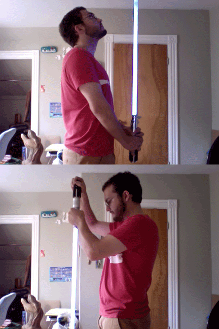
While I don't usually take photo reference when drawing thumbnails like this, I made an exception here as I really wanted to nail the poses, to sell the image as much as possible. Anywho, hope you like.
Have a good weekend, fellas.

2 comments:
I actually like this design better, the final was well done but this is a more striking image. I really like Odion's/your pose.
Thanks. It's definitely an idea I would like to bring to finish. Hopefully I'll get to tackle again in the future.
Post a Comment