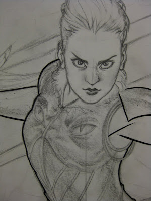
 I don't do this all that often, but I thought it might be fun to go through one of my recent pieces and break it down for you all step by step. On the chopping block? The cover to Amazing Spider-man #633.
Now the first thing I start with when approaching any illustration project is a rough thumbnail. Here I work out concept, composition and any other initial drawing details. This is probably the most important phase in the illustration process; it's where all the key decisions are made.
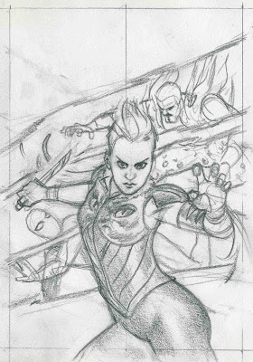
Pending approval by my editors, the piece goes on to the next phase: pencilling! I'll generally start by digitally blowing up my thumbnails to the scale I'll be working at (here, roughly 11'' x 17''). Next, I lightbox the blown-up thumbnail under my artboard and trace out the basic composition, fine tuning the drawing here and there. Since the initial thumbnail was fairly tight to begin with, there isn't too much editing I need to do through this stage.
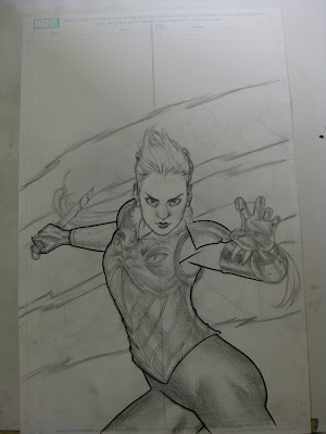
Following the initial trace, I get into drawing and slowly build up the form. Here, any rendering I might do serves solely as a blueprint for the coming inks.
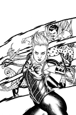
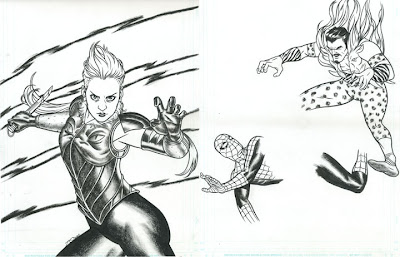
Just about all of my inking is done with a Windsor & Newton series 7 size 3 sable brush, though occasionally I'll use a size 1 for smaller details. These cover most of the line-work in the entire piece, with sparse nib or mechanical pen lines here or there. All of the 'rendered' areas in the piece are done with dry-brush, for which I use a crappy size 4 or 5 sable brush I keep lying around.
*I should note before going onto the next step that the original art was actually drawn on two separate boards to allow for easy separation when it comes to adding in digital color. I planned on digitally coloring the throwback line-work behind Kraven separate from the 'tear' lines encasing them. With the rough texture of the tears, I thought it easiest to draw each piece individually, and join them via layers in photoshop.
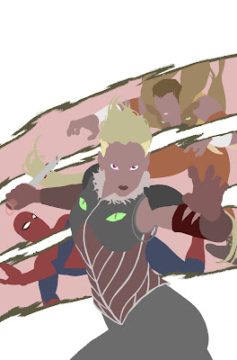
When coloring, I generally start by laying in big blocks of color, contouring to the overlaid inked line-drawing. These are called 'flats'. Nowadays, I usually farm out this task. The highly recommended and very talented Orpheus is responsible for these.
Then it's on to coloring. I'll do a more in-depth post about my coloring technique at some later date, but the basic gist of it involves me using a low-opacity, hard-edge brush to lay in initial tones, which I then later smooth out with a soft-edge brush. Because my brush is at a low opacity, no matter how saturated my foreground color is, when I make a stroke on the art surface, it comes out lighter. Each successive stroke over that initial one darkens and/or saturates that stroke.
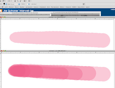
And here's a look at some of that in practice:
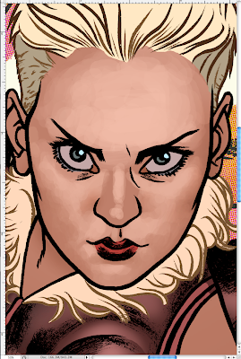
The initial roughing in of value,
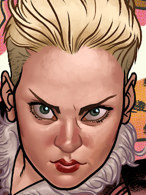
and the following 'smoothing' process.
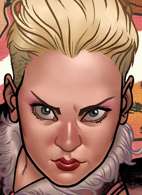
And, in case any of you forgot, here's the finished cover.
WHEW!! IT'S A MEGA POST. To quote Roy Scheider, "we're gonna need a bigger blog." ...Wait... is that the quote? Anywho, hope you all enjoyed this one. Hopefully it was helpful to SOMEBODY out there.
-Joey

7 comments:
Ya know, I've always wondered what your process was! Goooood shite Joe! I love your color work, your rendering is pretty realistic while your line art has almost a cartoonish quality to it! Great combo!
That was fascinating! Thanks for the behind-the-scenes look at your awesomeness.
Awesome Joe! Can't wait for the in debt coloring post.
Thanks guys!
Yeah, Manny - I'll try and get on that soon!
Wow! I'm also looking forward to the coloring post as well. Great job!
"Fellows, let's be reasonable, huh? This is not the time or the place to perform some kind of a half-assed autopsy on a drawing... And I'm not going to stand here and see that thing cut open and see that little Kintner boy spill out all over the dock."
I just found out... that a boy got KILLED by that drawing - and you KNEW it...
Hmm - I guess it's required for the comic book scene, but I much prefer the piece before the smoothing step - the brushwork looks much nicer.
Post a Comment